Logo design, web design, photography, UX/UI, product and package design, mobile apps, advertising, branding, game creating and animation – all these spheres require a designer portfolio, which is the most important part of your “face”. It is what the clients or employers see at first.
A design portfolio is a small booklet or a website with about 10 samples of your best works. It should be simple in navigation and usually consists of the following works: a drawing by hand, a vector picture, an advertisement design, a logo, a card, or an envelope, pages from a book, a calendar or catalog, and so on. A portfolio of a graphic designer should catch the eye by its creativity and beauty. When done well, it “sells” you to potential employers and shows that you are able to work with different instruments, in various styles. Use some tips to make the best portfolio and start your career in graphics design!
1. What platform to use?
Online portfolios have certain benefits compared to hardcore ones. So, you should consider editing an online version of your portfolio as well as a printed one. Loading your work on the web helps you reach more audiences and attract more potential clients. Besides, there is a huge variety of online instruments to create a breathtaking portfolio. These are cheap portfolio edit websites that will move the burden of signing up and configuring hosting from your shoulders: CargoCollective, Adobe Portfolio, Dribbble, Behance. On the other hand, Squarespace or Webflow is for those who can spend some money on contributing to their portfolio’s success.
2. What works to select?
Of course, choose the best works! However, it is also very important to showcase the diversity of your designs. This means that 5 good pictures in the same style cannot be added to your portfolio. Show two of them and leave room for another technique. Sometimes this means that you have to show works that are not fantastic or brilliant, but still shows that you can create in different genres.
3. Show your skills
Your portfolio should show your potential. Through your work, you can demonstrate that you’re a professional and can be the most creative in various tasks and tools. Graphic designers require excellent knowledge of professional programs such as Corel Draw, Figma, Adobe Creative Cloud and others. So, if you have experience with one of them, it’s worth showing it. Also, if you have years of art education under your belt then include this as well. This will show that you understand and can apply the composition and color rules to your design. Be honest, don’t add any skills that you’re not sure about or possess. Eventually, the truth will be revealed, and it’ll only hurt your reputation as a professional.
4. Use intrigue concepts
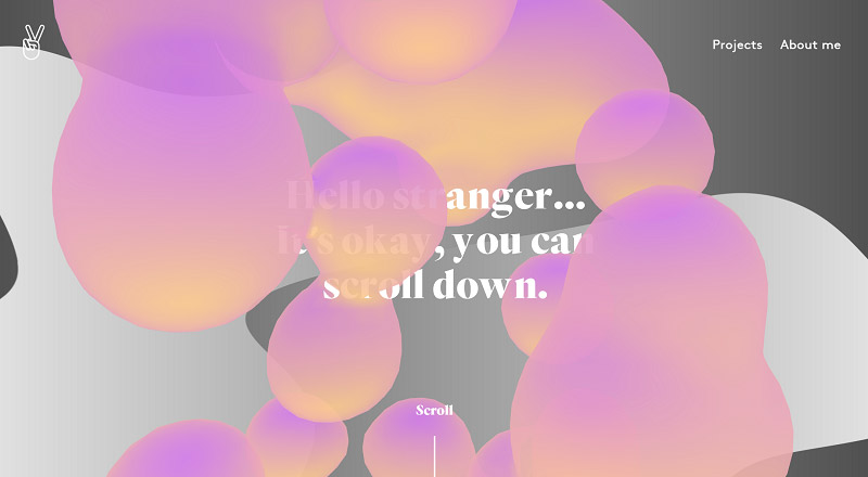
Julie Bonnemoy portfolio website
Concepts are thoughts and associations which are provoked in the mind by images. You need your works to create concepts, which will intrigue viewers and raise questions in their minds. Such a trick makes the work intriguing. This way design never seems trivial. Once you have interested the viewer, you should provide an explanation to it – a description of your design and the context of it. It can be a short piece of the essay below the work. You can also include information about your initial task or the target skills/techniques you used.
5. Use videos in your portfolio
You can embed a video into your portfolio that shows the process of your work. It may include sketches, rejected work options, etc. A video like this will make your portfolio dynamic and engaging. Moreover, this provides an opportunity to look at the work from the inside. In addition, with this video you can show that you have completed all the important stages of the project.
6. Be consistent and concise
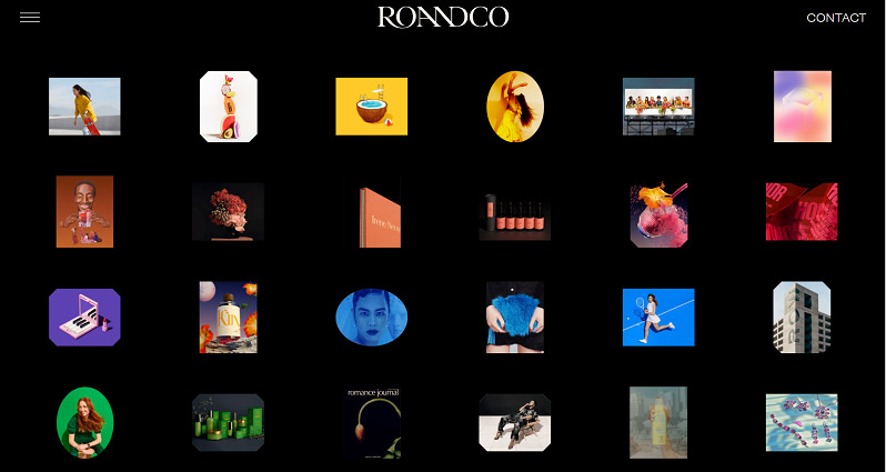
RoAndCo portfolio website
If you respect your clients, you honor their time and address their needs. So you need to make your portfolio effortless to use. For example, you can simplify navigation in your portfolio by cutting down on menu items, so your clients will easily scroll through your work. You need to make your portfolio standard and give the sections general headings (Projects, Contacts, About). Use simple techniques and apply facts about user patterns to draw visitors’ attention to the page and make your portfolio maximum user-friendly. Be brief. Do not display too many works at once, but present them in series, so they are equally appreciated. If you want to spicy up your work, you can experiment with colors or add interesting animation to the drawings, or to button-click.
7. Name the contributors
Make sure you give credit to the people, who took part in shaping the design, in the description of your work. If you participated in a team project, mention the people you worked with. Of course, you do not need to name the whole list of people, who took part in the project but do mention the main roles, like an art director or other designers. You can even add links to their portfolios. Such additions will display your interpersonal skills: you are able to work in a team and can deal with group projects.
8. Add social media
Nowadays about 60% of recruiters look at an applicant’s social media account before sending an invitation to a job interview. In this way, they find information about the character, interests and ability of the employee to communicate their thoughts. So be sure you link your accounts to the portfolio. What is more, you should send your LinkedIn account. LinkedIn is a special environment aimed at business communication and finding clients and employers.
9. Be careful with trends
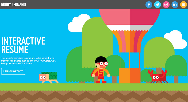
Robby Leonardi has one of those very transparent graphic design portfolios
The style of your portfolio should be dictated by principles of the sphere you are busy with, by the task requirements and by the trends. Of course, your work needs to maintain individuality, show your own outlook on life, but there is always a context of your work. The context includes the interests of the audience, the work’s relevance and the market. Look at the evolution of famous cartoon studios, at the development of arts, articles, design – they change with time to stay up-to-date. This way they ensure their work will be positively received and will meet the needs of audience.
Speaking about web design it is essential to be aware of trends. One of the main steps of creating a selling webpage is to browse for the latest tendencies and sample works of your competitors in the market. And the latest trends of today are simplicity and user-friendly design. That is the rule that is taught to specialists in website development. On the other hand, if there is a trend on the market, it usually means it has already reached the height of popularity and users are already fed up with it. So, using it in your work too may be a disaster. Moreover, there is no such need to always satisfy the audience. Some artists were not positively received at first, because their works were groundbreaking. If designers blindly use trendy prints and styles in most parts of their works, it looks like they do not work well and lack creativity. They just copy other people’s works. So, if you just follow the trends, without any adaptation to your style– it means you do not create a unique product. You can add a few popular elements in your portfolio, but only if they are the most appropriate and hit the box. The awareness of trends itself is good. So, the key point is that you should select the best way to express your idea, be it the most popular and wide-used or quite exotic and groundbreaking.
10. What to do if you lack experience and projects
The main problem for aspiring designers is the lack of good projects and experience in general. So, what can you do to fix this problem?
The first option is to take up a design challenge or try volunteering for charities and nonprofit organizations. This way you will not only diversify collection of your works, but also show that you are proactive, can address a challenge, and solve the task at hand creatively. Moreover, you will build up experience in the sphere, handle various projects and collect the most wonderful works. Alternatively, you can try experimenting with existing designs. Try to suggest something new. This will help you not only add an additional project to your portfolio but will also show your future employers that you can look at things from a different angle.
Your portfolio can include brave and experimental style or cute design in pastel colors but it should still be powerful and intriguing. For instance, use bold print to catch the eye. Best works on the web are displayed artistically and express interesting personalities. Most portfolios have spacious layouts and photographs that tell amusing visual stories about fashion, lifestyle, and music. All in all, be brief in your portfolio, but still powerful, make the standard of the formal part, but develop individual style in your works, choose the best way to convey your idea, use various instruments for it. Once you create a breathtaking portfolio you can easily apply it to your VC on job searching websites and draw the attention of employers!
Premium Downloads:
You have to attribute CreativeAlys for free design resources you download from this website.
Design by creativealys.com
Copy the above line and paste it in a visible place, close to where you’re using the design resource.








Leave a Comment